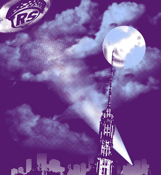
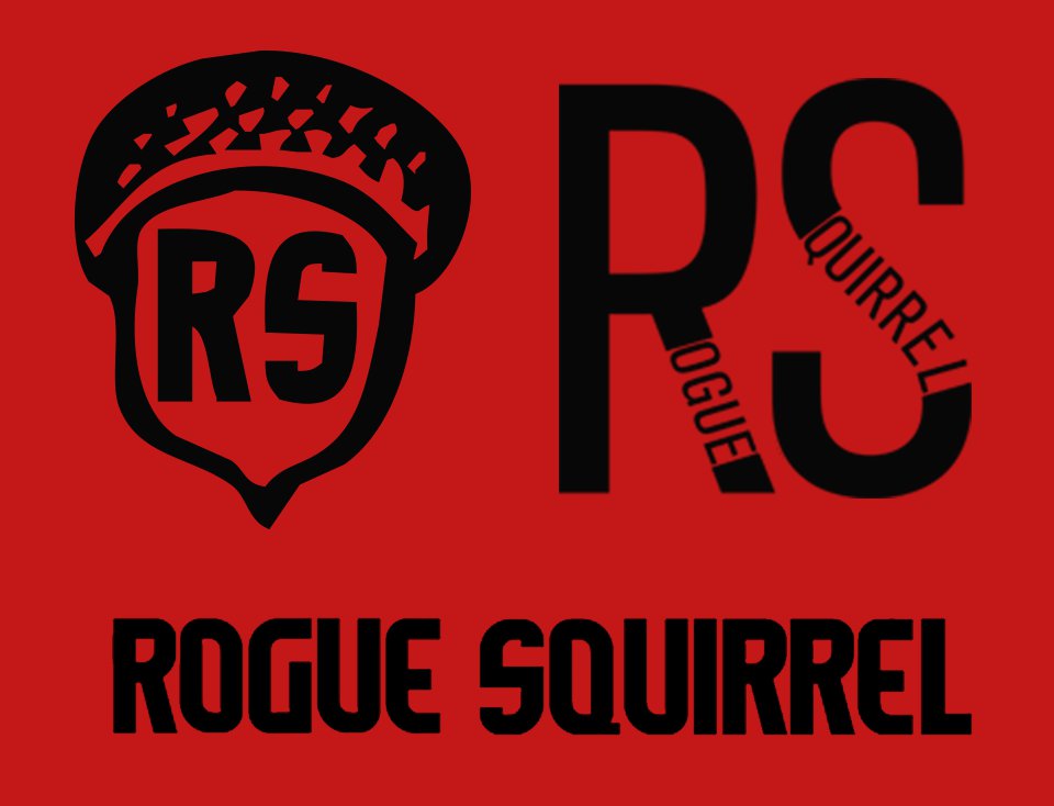
Rogue Squirrel Feature
Rogue Squirrel Header

Rogue Squirrel

Branding, Web & Apparel Design

Rogue Squirrel Logos

Who: Rogue Squirrel, Inc.

What: Branding, Web & Apparel Design

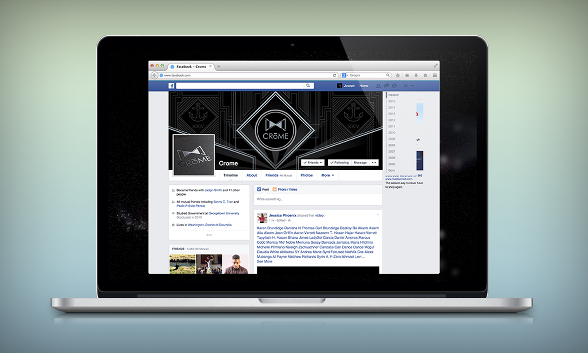
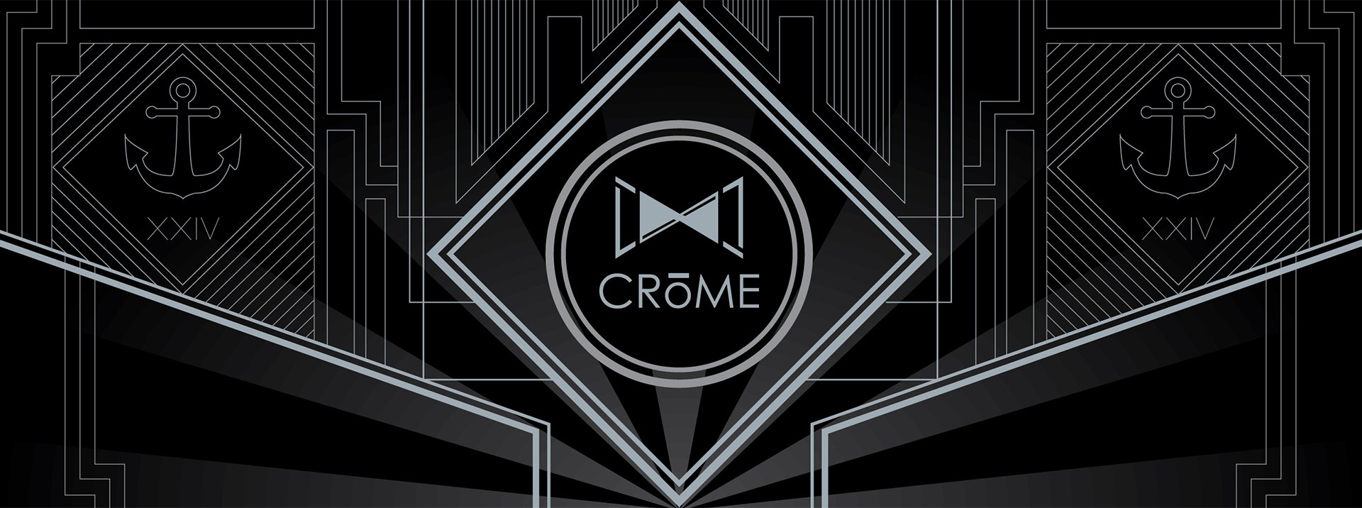
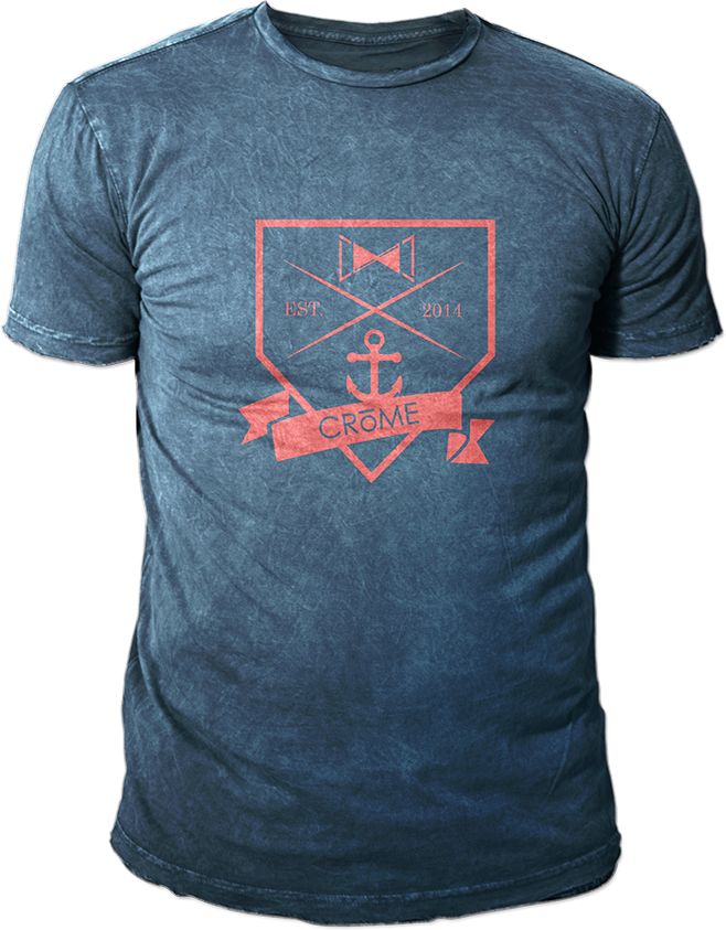
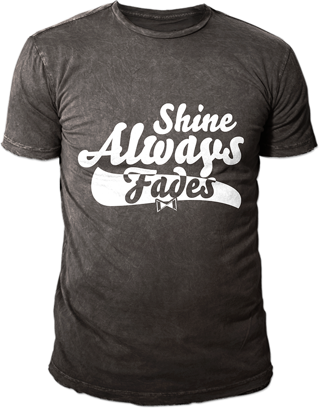
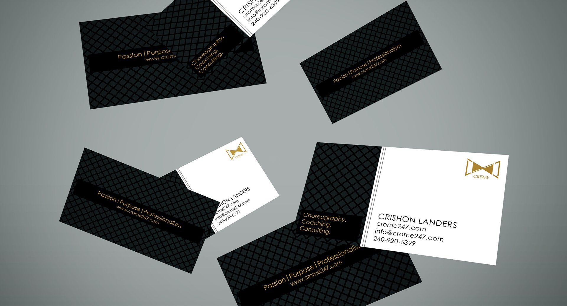
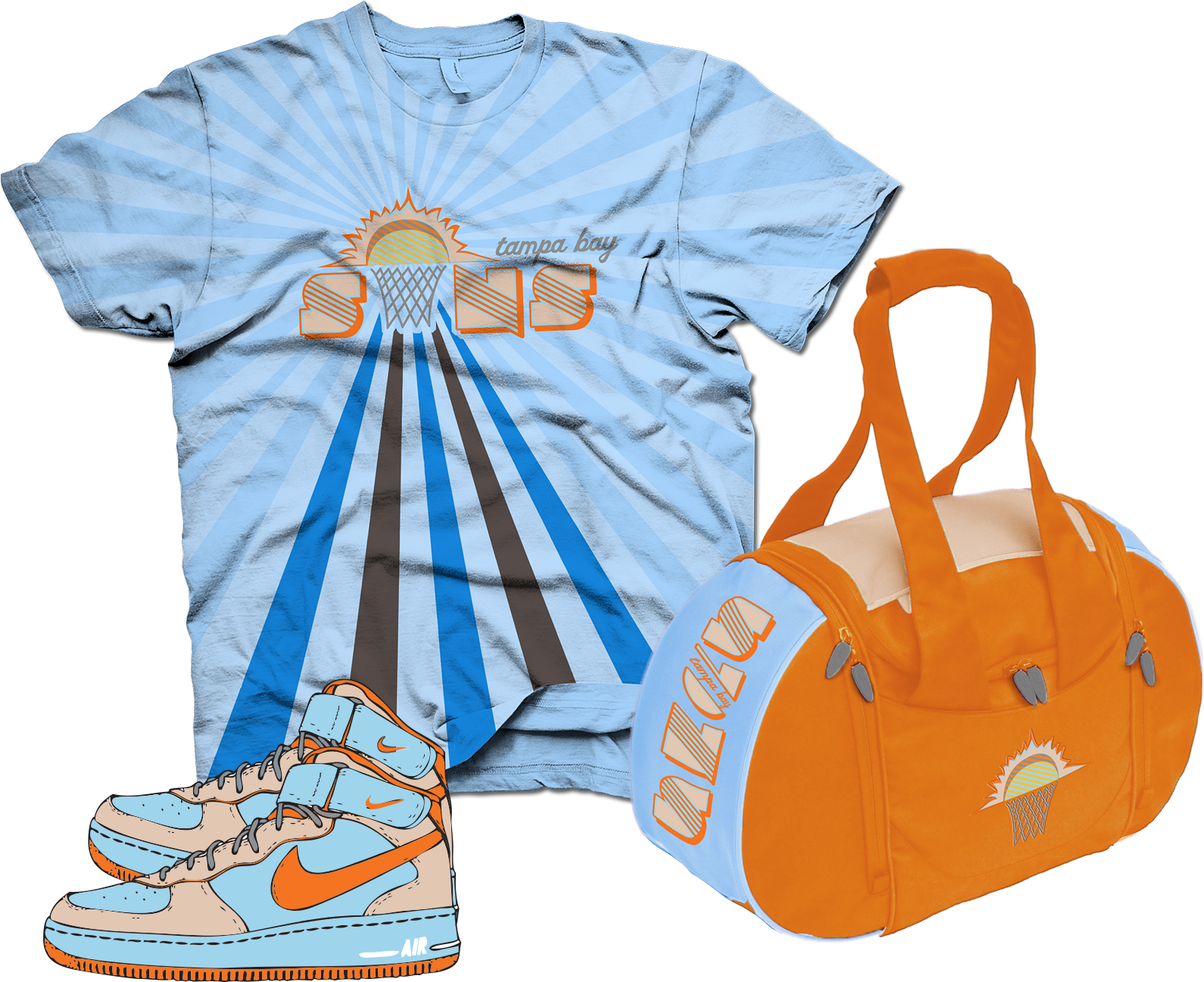
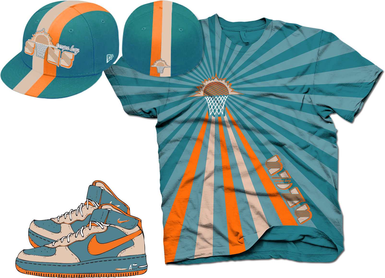
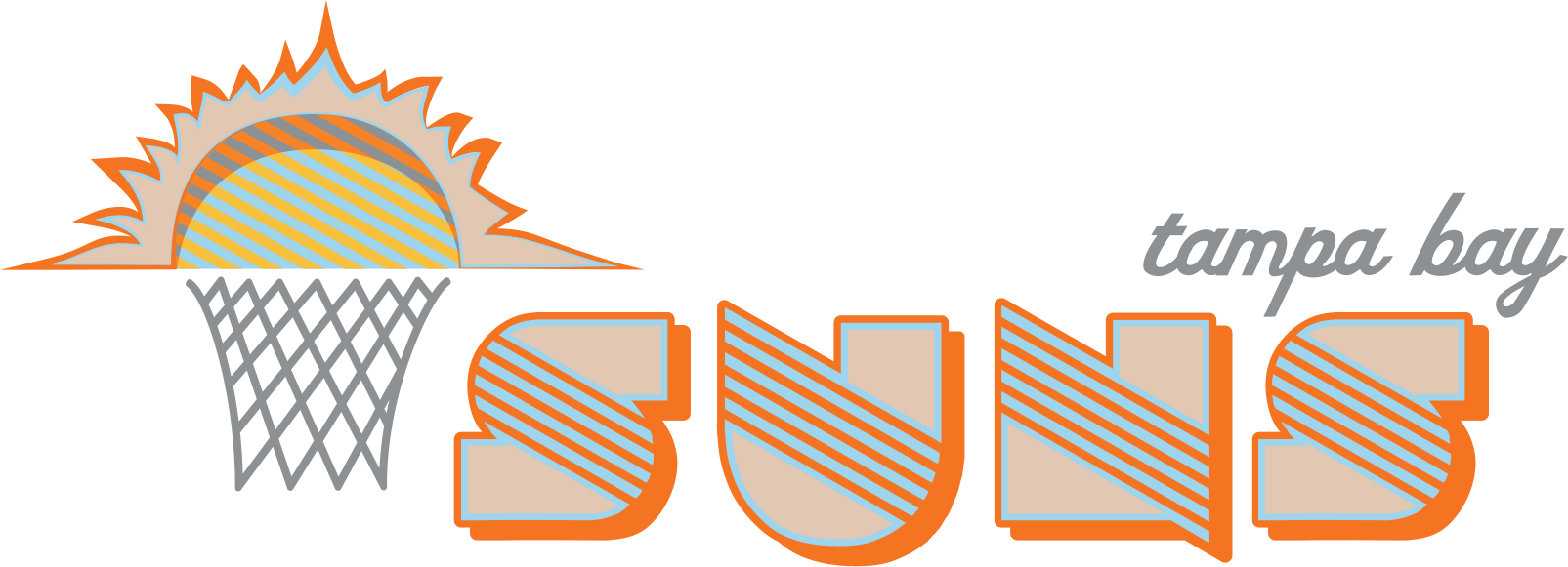
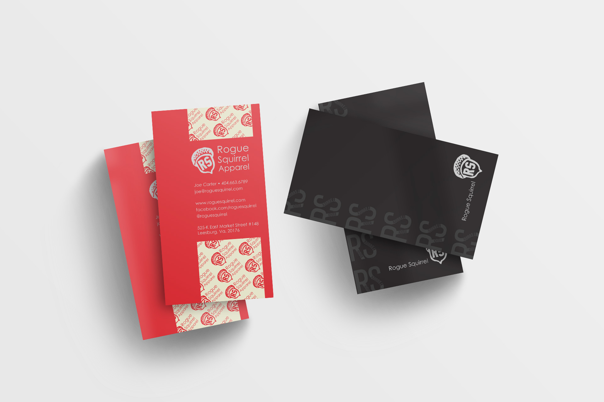
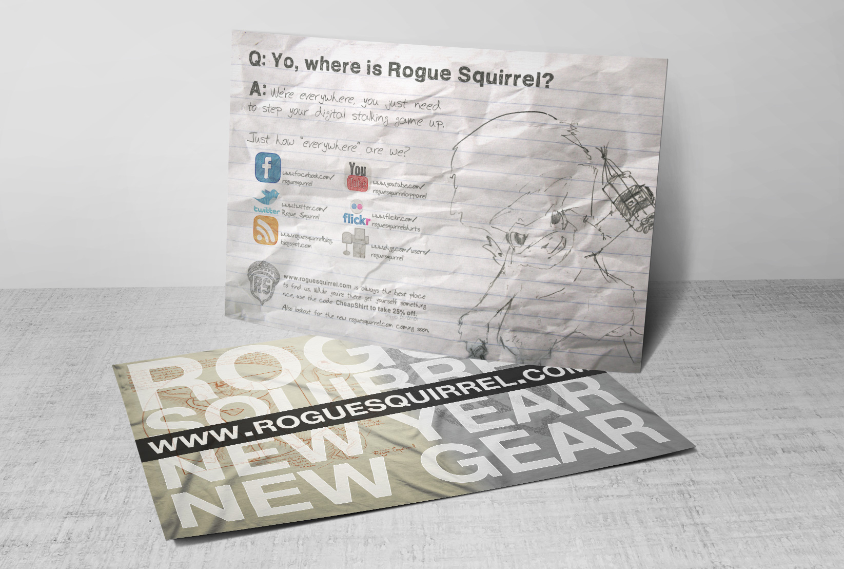
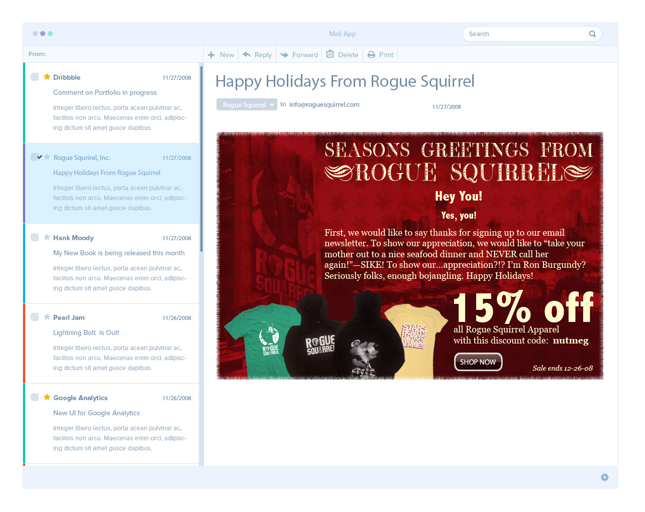
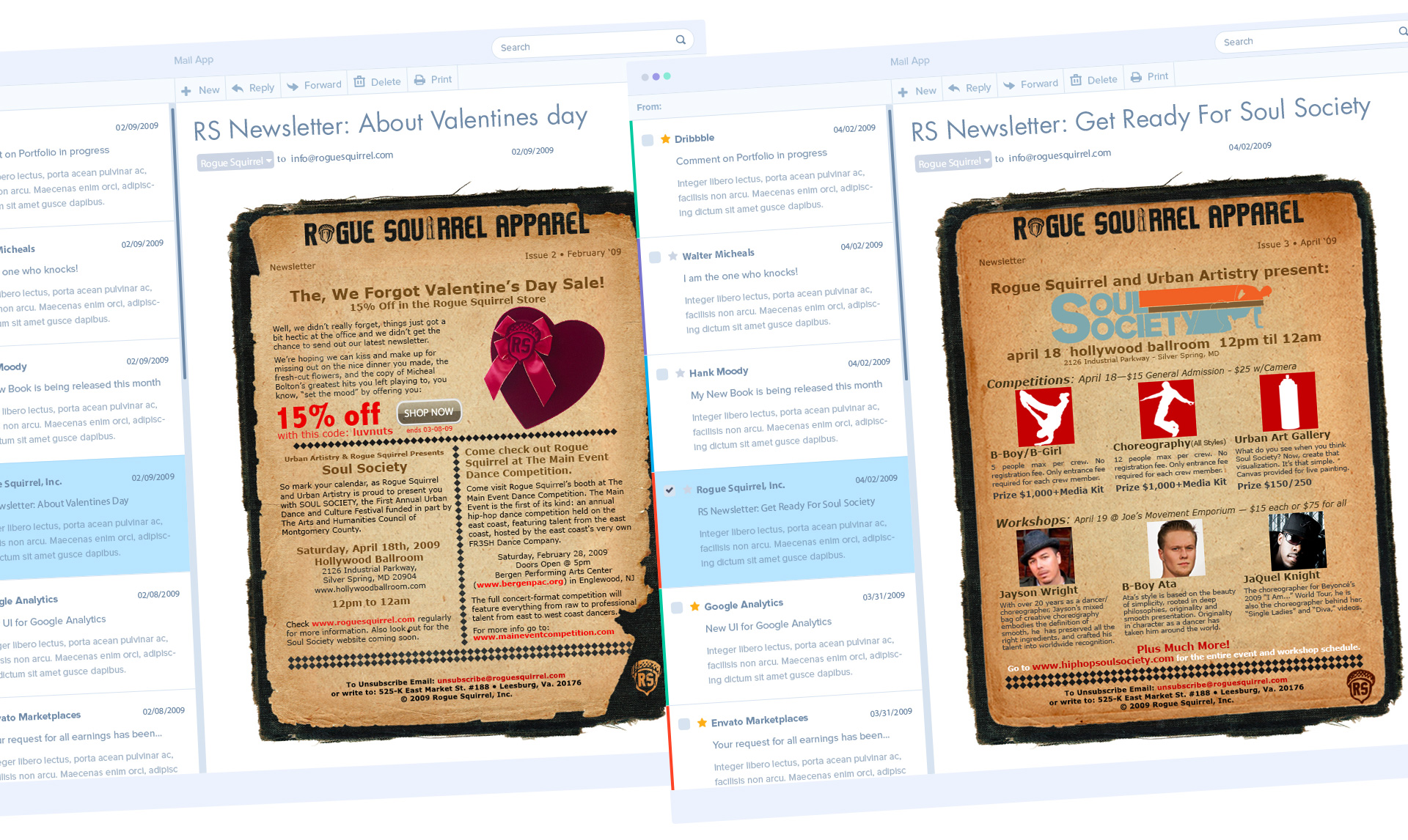
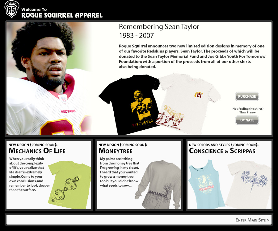
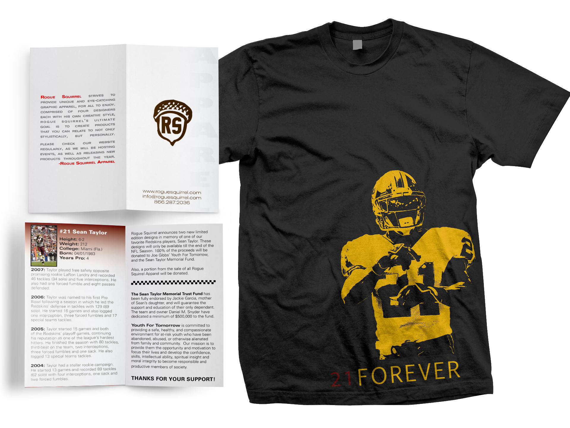
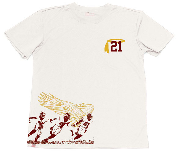
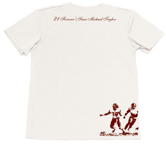
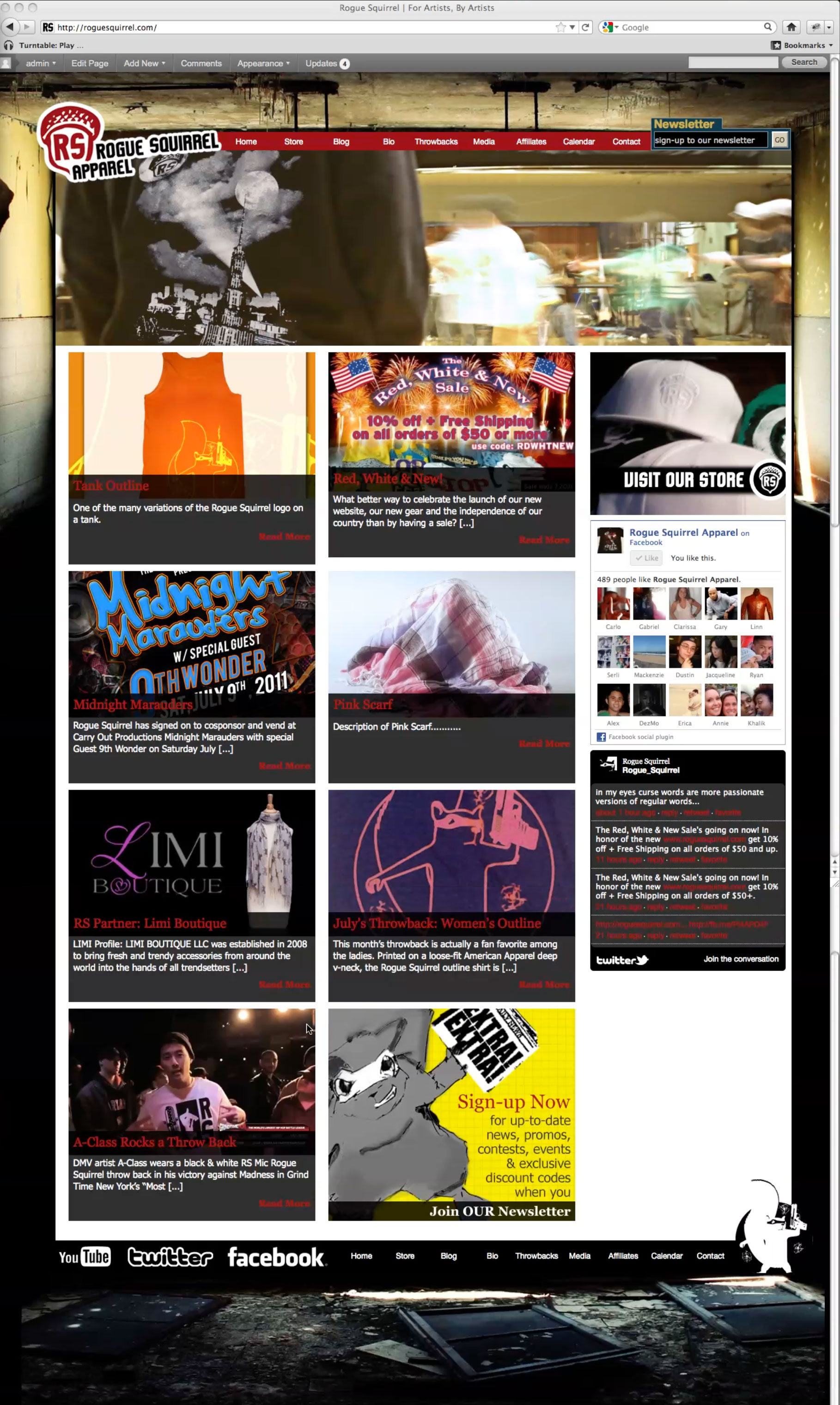
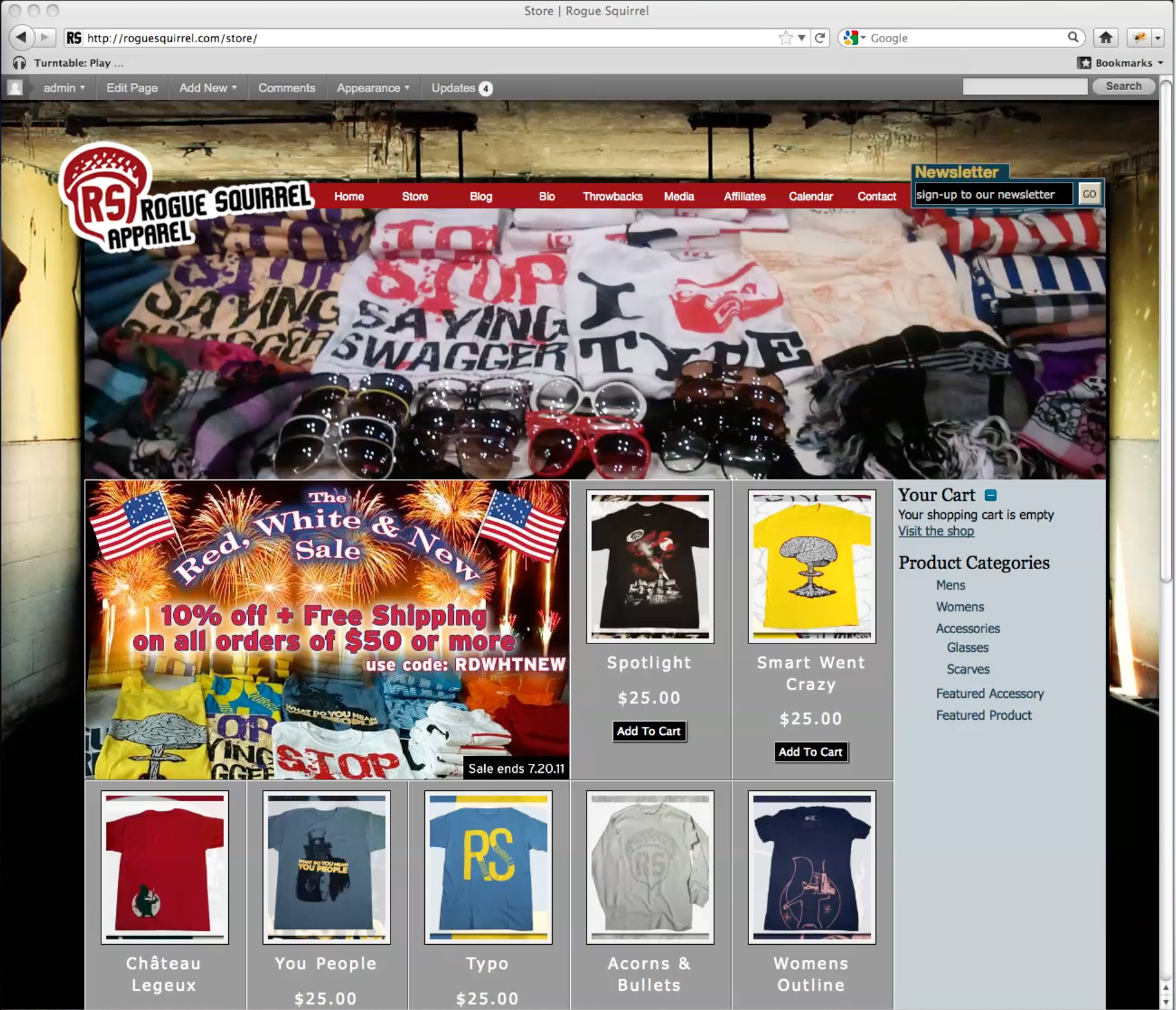
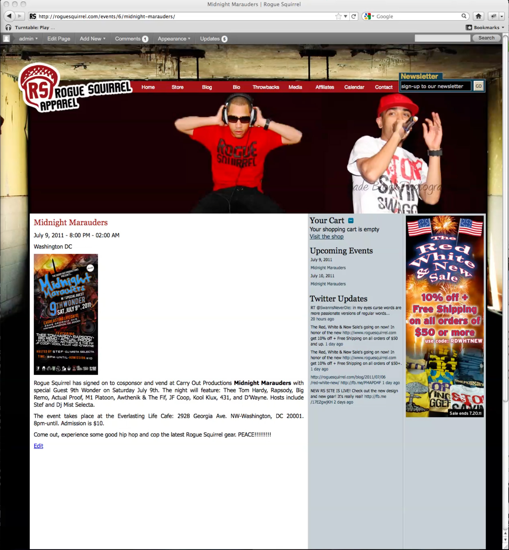
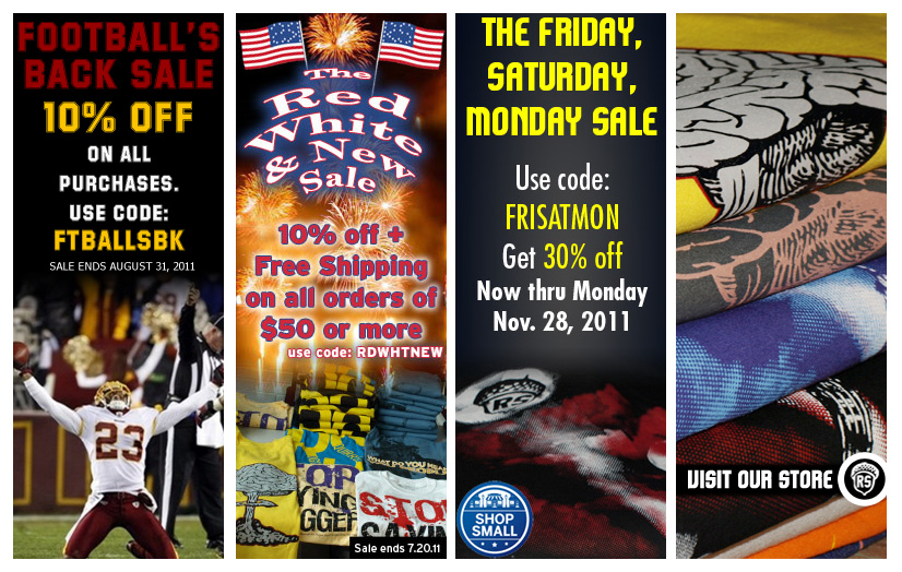
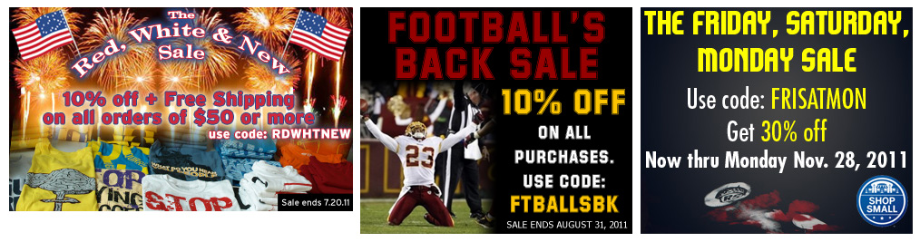
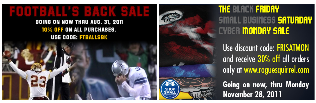
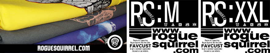
Why: A graphic apparel brand & screen printing company specializing in designs that often featured anything from tongue-in-cheek humor to comic book references to hip-hop appreciation etc. Rogue Squirrel’s varied designs related to a broad demographic both stylistically and personally. In managing the brand’s image, design needs ranged from t-shirt designs, to website creation & maintenance, email newsletter designs, promo postcards, custom tags for shirts, web ads etc.

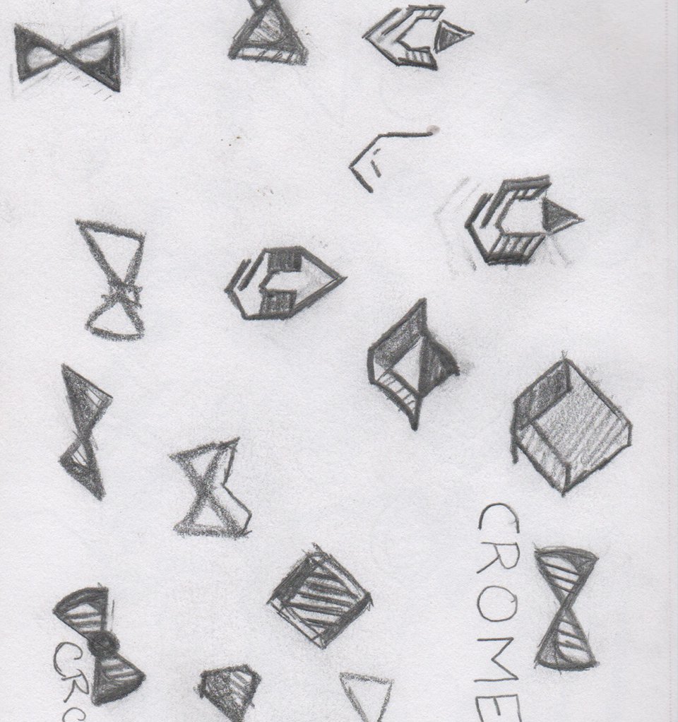
Role: Concept Development, Art Direction, Copywriting & Design

Rogue Squirrel Biz Card
Rogue Squirrel Postcard
Rogue Squirrel Email Ad
Rogue Squirrel Newsletter
Rogue Squirrel Sean Taylor Splash Page
Rogue Squirrel Sean Taylor Collection
Sean Taylor Wings Front
alt="Sean Taylor Wings Back"
Rogue Squirrel Home Page
Rogue Squirrel Store
Rogue Squirrel Inside Page
Rogue Squirrel Site Ads 4up
Rogue Squirrel Site Ads 3up
Rogue Squirrel Ads 2up
Rogue Squirrel Fill Ad & Custom Tags
GR8smokyHeader

Great Smoky Mountains

Brochure Design

brochureFRONT

Who: Great Smoky National Park

What: Brochure Design

Why: A promotional brochure for Great Smoky National Park, a means to drive visitation and exploration within the park. The design concept included a conscious decision to have descriptions and other text take a backseat to the imagery, thus allowing the park to sell itself by-way of its beautiful scenery. The layout was meant to take the reader on a journey, with the gate-fold design used to evoke a sense of exploration and build anticipation from a first-person perspective; with a newer, even more majestic view behind each fold.

Role: Concept Development & Design

brochureGATE
brochureSPREAD
brochureBACK
CromeHeader

Crome

identity development and apparel design

CROMElogos

Who: Crome LLC.

What: Identity Development

Why: CRoME is a high-end performance, education and fashion brand that specializes in hip-hop dance choreography and instruction. The brand identity needed to represent the sense of quality, strength, intelligence, dynamism and professionalism of its owner Maryland native choreographer & performer Crishon Jerome Landers.

Role: Art Direction, Concept Development & Design

CromeBlackPage
cromemacbookMock
Crome-FB-Banner
ShieldShirt
ShineShirt
CromeMockup-card
CromeJumperMockUp
ChromeLogoBG
CromeSketch

Check out this sketch & others:
In My Sketchbook >

parnassushead

Parnassus Boards

Branding • Merchandising

parnassuslogos

Who: Parnassus Skateboards

What: Identity, Collateral & Merchandise

Why: In Greek Mythology Mount Parnassus—the landing spot for the boat of King Deucalion (son of Prometheus) and his wife Pyrrha—revealed itself as a source of refuge, strength and protection after the waters of the great flood had receded. Parnassus Boards as a skateboarding & lifestyle brand represents a similar strength, quality, and dependability, for skaters with heart, passion and grace. Seeking out those who strive to take their skills to the highest peaks, all the while doing it with flair. The geometric style of the design represents the precise nature of skateboarding, as well as the angular nature of skate environments.

Role: Concept Development & Design

parnassusMerchandise
parnassusSkatedeck
parnassusFeatureBoard
featSketchpnassus

Check out this sketch & others:
In My Sketchbook >

TBSUNSheader

Tampa Bay Suns

Team Branding

tampa_suns_logo

Who: Phoenix Suns Basketball

What: Team Relocation Concept

Why: This rebranding and relocation of the Phoenix Suns to Tampa Bay utilizes colors and design styles that are indicative of the Tampa Bay area. The sun setting into the net logo was a way to differentiate the design, without going the clichéd basketball as sun idea. Apparel design plays off of the bright and fun Tampa-based color palette.

Role: Concept Creation & Design

blueMERCH
darkMERCH
tampa_suns_logotype
uniforms
hitchHEADER

The Hitchhiker’s Guide to the Galaxy

Book Cover Redesign

hitchFRONT

Who: The Hitchhiker’s Guide To The Galaxy

What: Cover Redesign Concept

Why: This redesign of a sci-fi classic intended to add a sense of wonder and curiosity that is typical within the genre. The design incorporates certain thematic elements found within storyline, such as: the towel, the number 42, and a general space adventure & exploration aspect via the starry field upon which we find the foreground figure gazing.

Role: Concept Development & Design

hitchCOVER
hitchBACK
Carter_Joe-Book
TMVheader

The Mars Volta

Event Poster

faceCLOSE

Who: The Mars Volta

What: Poster Design

Why: This Dada-inspired poster design was created as a tour promotion for The Mars Volta’s album Noctourniquet. Influenced by the album name, “Noctourniquet” a portmanteau of nocturne and tourniquet the design references the theme of capture, and subjugation prevalent in many of the songs. The imagery portrays that of a bad dream and someone hoping for escape. The background was created by layering watercolor paintings representing Heaven and Hell, with a cut out of opposing faces laid atop to imply a sense of struggle. The hand-made lettering was meant to play off of a ransom note, again following the same theme of capture.

Role: Concept Creation & Design

posterMOCK
typeCLOSEup
gingerHeader

Ginger Beauty

Identity Development, Collateral, Website

gbLogoType

Who: Ginger Beauty, LLC.

What: Identity Design, Website & Bus. Card

Why: Ginger Beauty is cosmetics and lifestyle brand that specializes in eyelash extensions, custom makeups and one-to-one consultations. The brand identity and website needed to bring an edgy appeal, with a personal touch that could simultaneously reflect the professional, smart, chic and fun clientele that Ginger Beauty serves.

Role: Concept Development & Design

gbCards
GBbottle
gingerSqueezebotle
ginger-site-mockup
gingerSite
gingerSite
GBsketches

Check out this sketch & others:
In My Sketchbook >

xypiheader

XYPI – Call Me Zippy

Branding • Advertising

Who: XY P.I.

What: Branding, Packaging & Ad Concept

Why: A re-imagining of the branding for the computer mouse, had it gone by its original name, “XY Position Indicator” with a modern twist. The “Zippy” nickname was a catchy way to pronounce the abbreviation and add memorability; with a retro futuristic design, a tip-of-the-hat to the early days of the PC.

Role: Concept Creation & Design

xypiPosterMock
xypibox
xypibox
xypiSketch

Check out this sketch & others:
In My Sketchbook >

Page 2 of 212